快收藏!超实用标签title属性重写,让同事对你刮目相看
原生title属性的弊端
日常开发中,我们经常会遇到hover文本,显示其全部内容的需求。但是原生的title属性有两个很大的缺点
- 样式丑陋,无法更改
windows下的样式
mac下的样式
- 不够智能,属性显影只能人为控制
只要写了title属性,hover文本一定会展示。但有些场景,我们需要的功能是,文本超出后,才显示title属性;文本不超出后,不显示title属性。
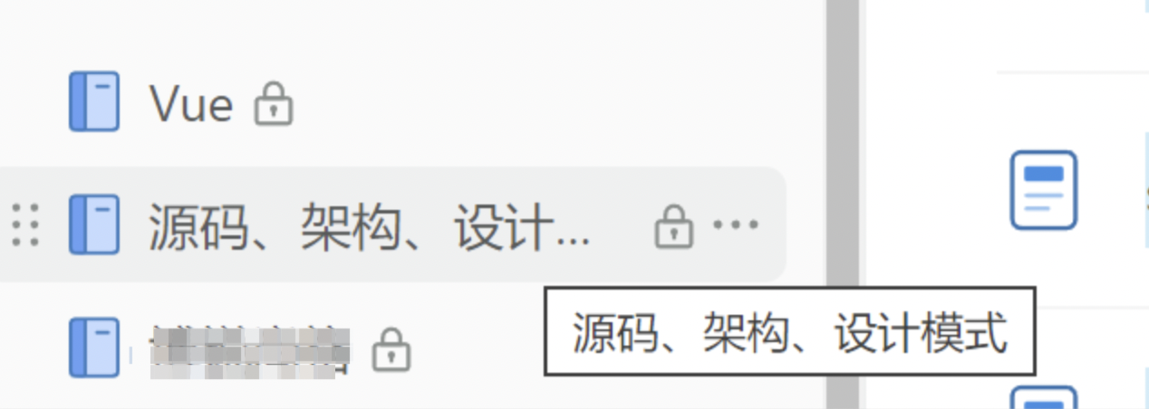
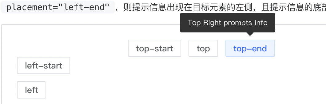
如图,我们期望的是,被圈起来的部分,hover文本后出现title属性的提示;为圈起来的文字不需要title提示。
但是,title属性很那用,一旦你写了,它永远都会hover显示。
那么,针对上述问题,本文将对title属性进行优化,模拟实现一个更好用的title属性,它具备下面的功能。
- 样式好看(支持自定义):
- 仅超出的文本显示title提示:

相信阁下使用后,一定会让你们的同事领导对你刮目相看,想起他们故乡的妈妈桑!
为什么不使用第三方组件
有人一定会问,为什么不使用elementPlus的toolTip组件
我的回答是:
- 项目中没有或不能引入其他UI库
- 它的样式不满足我的需求
- 我想实现一些个性化功能
如果还有人和我杠,我就一句话: 我就想手搓一个,我乐意!
实现思路
首先,我们要明确的是,重写原生标签的 title 属性样式在纯 HTML 和 CSS 中是不可能的。不过,我们需要使用自定义的提示框(tooltip)来实现类似的效果,并对其样式进行完全控制。
大致思路就是:获取文本的鼠标hover位置,全局创建一个div盒子,用fixed布局浮动显示。
本文只抛砖引玉,做基础的代码演示,方便各位读者阅读。大家可以根据业务情况自行完善。
为了提升大家的学习效果,大家可以使用云VCSODE运行下面的demo代码。
云vscode参考地址:https://juejin.cn/post/7388753413309349903(文末链接)
云vscode免配任何环境,可快速运行demo。
技术方案
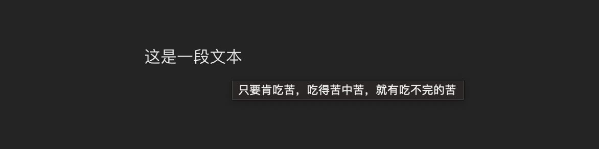
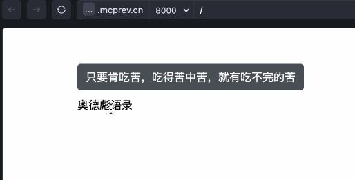
我们对下面的代码模拟hover实现title属性,hover提示:只要肯吃苦,吃得苦中苦,就有吃不完的苦
原生html
<div class="title">
  奥德彪语录
</div>
我们的大致方案是,hover时(mouseenter),获取当前dom元素,计算出它的位置。然后创建一个全局div,自定义一些样式,写入文本。鼠标 离开时,销毁当前元素。
基础框架
大致的逻辑框架代码如下:
<!DOCTYPE html>
<html lang="en">
<head>
    <meta charset="UTF-8">
    <meta name="viewport" content="width=device-width, initial-scale=1.0">
    <title>Custom Tooltip</title>
    <link rel="stylesheet" href="styles.css">
</head>
<body>
    <div class="title" οnmοuseenter="createTip">奥德彪语录</div>
</body>

<script>
const titleDom = document.querySelector('.title');
let tipDiv= null
titleDom.addEventListener('mouseenter', ()=>{
  // 创建一个tip提示div
  tipDiv = document.createElement('div');

})
titleDom.addEventListener('mouseleave', ()=>{
  // 销毁tip提示div
})


</script>
</html>
完善mouseenter方法
const titleDom = document.querySelector('.title');
let tipDiv= null
titleDom.addEventListener('mouseenter', ()=>{
  // 创建一个tip提示div
  tipDiv = document.createElement('div');
  tipDiv.className = 'custom-tooltip';
  tipDiv.innerText = '只要肯吃苦,吃得苦中苦,就有吃不完的苦';
  document.body.appendChild(tipDiv);
  // 计算tip提示框的位置
  // 获取 titleDom 元素的边界矩形信息
  const rect = titleDom.getBoundingClientRect();
  // 获取 tipDiv 元素的边界矩形信息
  const tipRect = tipDiv.getBoundingClientRect();
  tipDiv.style.left = rect.left +'px';
  tipDiv.style.top = `${rect.top - tipRect.height -10}px`;
})
我们完善一下custom-tooltip的样式
<style>
  .title{
    margin: 100px;
  }
  .custom-tooltip{
    position: fixed;
    padding: 8px 12px;
    background: rgba(27, 33, 41, .8);
    color: #ffffff;
    border-radius: 5px;
    border: 1px solid rgba(27, 33, 41 .8);
    z-index: 99;
  }
</style>
试试效果,看起来还不错。
完善mouseleave方法
现在,我们实现离开dom,移除tip提示的效果。
titleDom.addEventListener('mouseleave', ()=>{
  // 销毁tip提示div
  tipDiv.remove();
})
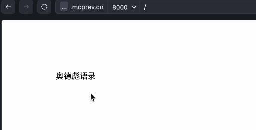
完善文本超出才显示tip效果
要想实现这个效果,首先我们需要判断文本是否超出显示。如果超出,hover显示tips提示,否则不显示。
先改造样式,让文本超出显示…
.title{
  margin: 100px;
  width: 50px;
  overflow: hidden;
  text-overflow: ellipsis;
  white-space: nowrap;
}
现在hover,文本一定是一直显示的。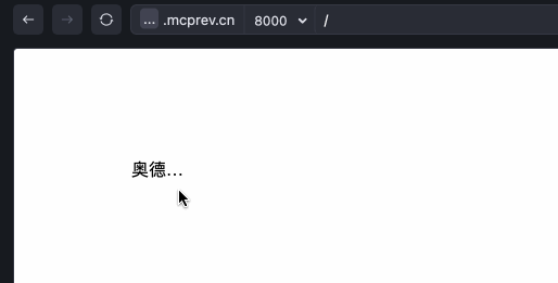
判断文本是否超出其容器,可以通过比较文本内容的实际尺寸和容器的尺寸来实现。
const titleDom = document.querySelector('.title');

if (titleDom.scrollWidth > titleDom.clientWidth) {
  console.log('文本超出');
} else {
  console.log('文本没有超出');
}
那么,代码的修改就非常容易了
titleDom.addEventListener('mouseenter', ()=>{
  if (titleDom.scrollWidth <= titleDom.clientWidth) {
    return
  }
  // ...原来的逻辑
})
titleDom.addEventListener('mouseleave', ()=>{
  // 销毁tip提示div 兼容写法
  tipDiv?.remove?.();
})
完整代码
<!DOCTYPE html>
<html lang="en">
<head>
    <meta charset="UTF-8">
    <meta name="viewport" content="width=device-width, initial-scale=1.0">
    <title>Custom Tooltip</title>
    <link rel="stylesheet" href="styles.css">
    <style>
      .title{
        margin: 100px;
        width: 50px;
        overflow: hidden;
        text-overflow: ellipsis;
        white-space: nowrap;
      }
      .custom-tooltip{
        position: fixed;
        padding: 8px 12px;
        background: rgba(27, 33, 41, .8);
        color: #ffffff;
        border-radius: 5px;
        border: 1px solid rgba(27, 33, 41 .8);
        z-index: 99;
      }
    </style>
</head>
<body>
    <div class="title">奥德彪语录</div>
</body>

<script>
const titleDom = document.querySelector('.title');
let tipDiv= null
titleDom.addEventListener('mouseenter', ()=>{
  if (titleDom.scrollWidth <= titleDom.clientWidth) {
    return
  }
  // 创建一个tip提示div
  tipDiv = document.createElement('div');
  tipDiv.className = 'custom-tooltip';
  tipDiv.innerText = '只要肯吃苦,吃得苦中苦,就有吃不完的苦';
  document.body.appendChild(tipDiv);
  // 计算tip提示框的位置
  // 获取 titleDom 元素的边界矩形信息
  const rect = titleDom.getBoundingClientRect();
  // 获取 tipDiv 元素的边界矩形信息
  const tipRect = tipDiv.getBoundingClientRect();
  tipDiv.style.left = rect.left +'px';
  tipDiv.style.top = `${rect.top - tipRect.height -10}px`;
})
titleDom.addEventListener('mouseleave', ()=>{
  // 销毁tip提示div
  tipDiv?.remove?.();
})


</script>
</html>
封装成一个方法
<!DOCTYPE html>
<html lang="en">
<head>
    <meta charset="UTF-8">
    <meta name="viewport" content="width=device-width, initial-scale=1.0">
    <title>Tooltip Component</title>
    <link rel="stylesheet" href="styles.css">
</head>
<body>
    <script>
        class Tooltip {
            constructor(titleDom, text) {
                this.titleDom = titleDom;
                this.text = text;
                this.tipDiv = null;
                this.titleDom.addEventListener('mouseenter', () => {
                    this.show();
                });
                this.titleDom.addEventListener('mouseleave', () => {
                    this.hide();
                });
            }

            show() {
                if (this.titleDom.scrollWidth <= this.titleDom.clientWidth) {
                    return;
                }
                this.tipDiv = document.createElement('div');
                this.tipDiv.className = 'custom-tooltip';
                this.tipDiv.innerText = this.text;
                document.body.appendChild(this.tipDiv);
                const rect = this.titleDom.getBoundingClientRect();
                const tipRect = this.tipDiv.getBoundingClientRect();
                this.tipDiv.style.left = `${rect.left}px`;
                this.tipDiv.style.top = `${rect.top - tipRect.height - 10}px`;
            }

            hide() {
                if (this.tipDiv) {
                    this.tipDiv.remove();
                }
            }
        }

        const titleDom = document.querySelector('.title');
        const tooltip = new Tooltip(titleDom, '只要肯吃苦,吃得苦中苦,就有吃不完的苦');
    </script>
</body>
</html>
优化项
对于这个demo其实还有很多优化项,比如
- 如何让控制tip的位置居中
- 主题设置(黑白主题)
由于原生html用的很少,这里只简单展示一些技术思路,其他效果大家自行实现。
vue框架中实现
封装成一个组件
在vue中实现就简单很多了,比如,我们可以像下面一样简单粗暴,直接控制tooltip文本的显示隐藏即可。
<template>
  <div class="title-wrapper" @mouseenter="showTooltip" @mouseleave="hideTooltip">
    <div class="title">{{title}}</div>
    <span v-if="showTooltipFlag" class="tooltip">{{tooltipText}}</span>
  </div>
</template>

<script setup>
import { ref } from 'vue';

const props = defineProps({
  title: String,
  tooltipText: String
});

const showTooltipFlag = ref(false);

function showTooltip() {
    if (this.titleDom.scrollWidth <= this.titleDom.clientWidth) {
      return;
    }
    showTooltipFlag.value = true;
}

function hideTooltip() {
    showTooltipFlag.value = false;
}
</script>

<style scoped>
.title-wrapper{
  width: 50px;
  overflow: hidden;
  text-overflow: ellipsis;
  white-space: nowrap;
  cursor: pointer;
  position: relative;
}

.title{
  margin: 100px;
}

.tooltip{
  position: absolute;
  padding: 8px 12px;
  background: rgba(27, 33, 41,.8);
  color: #ffffff;
  border-radius: 5px;
  border: 1px solid rgba(27, 33, 41.8);
  z-index: 99;
  white-space: normal;
  top: -30px;
  left: 0;
  width: 200px;
  pointer-events: none;
}
</style>
如果你觉得这种组件的形式不够优雅,我们可以直接封装成一个vue指令。
封装成一个指令
定义自定义指令
在 v-tooltip.js 中定义自定义指令,并将样式动态添加到页面。
// src/directives/v-tooltip.js
const tooltipStyles = `
.custom-tooltip {
  position: fixed;
  padding: 8px 12px;
  background: rgba(27, 33, 41, 0.8);
  color: #ffffff;
  border-radius: 5px;
  border: 1px solid rgba(27, 33, 41, 0.8);
  z-index: 99;
}
`;

function addTooltipStyles() {
  const styleElement = document.createElement('style');
  styleElement.innerHTML = tooltipStyles;
  document.head.appendChild(styleElement);
}

export default {
  mounted(el, binding) {
    addTooltipStyles();

    let tipDiv = null;

    const showTooltip = () => {
      if (el.scrollWidth <= el.clientWidth) {
        return;
      }
      tipDiv = document.createElement('div');
      tipDiv.className = 'custom-tooltip';
      tipDiv.innerText = binding.value || '只要肯吃苦,吃得苦中苦,就有吃不完的苦';
      document.body.appendChild(tipDiv);
      const rect = el.getBoundingClientRect();
      const tipRect = tipDiv.getBoundingClientRect();
      tipDiv.style.left = `${rect.left}px`;
      tipDiv.style.top = `${rect.top - tipRect.height - 10}px`;
    };

    const hideTooltip = () => {
      if (tipDiv) {
        tipDiv.remove();
        tipDiv = null;
      }
    };

    el.addEventListener('mouseenter', showTooltip);
    el.addEventListener('mouseleave', hideTooltip);

    el.__showTooltip__ = showTooltip;
    el.__hideTooltip__ = hideTooltip;
  },
  unmounted(el) {
    el.removeEventListener('mouseenter', el.__showTooltip__);
    el.removeEventListener('mouseleave', el.__hideTooltip__);
  }
};
注册指令
在 main.js 中注册这个自定义指令。
// src/main.js
import { createApp } from 'vue';
import App from './App.vue';
import vTooltip from './directives/v-tooltip';

const app = createApp(App);

app.directive('tooltip', vTooltip);

app.mount('#app');
使用指令
在你的组件中使用这个自定义指令。
<!-- src/components/TooltipExample.vue -->
<template>
  <div class="title" v-tooltip="'只要肯吃苦,吃得苦中苦,就有吃不完的苦'">
    奥德彪语录
  </div>
</template>

<style scoped>
.title {
  margin: 100px;
  width: 50px;
  overflow: hidden;
  text-overflow: ellipsis;
  white-space: nowrap;
}
</style>
总结
本文介绍了原生title属性的一些优化思路和方法,相信对大家有一定帮助。由于时间问题,本文没有做组件或指令的深度封装,比如提示框出现的位置等等还不支持个性化自定义位置等等。但是,基于demo,已经达到项目可用的地步了,大家可以基于自己的项目自行完善。
如果你很懒,想让我帮你实现更多具体功能,请评论区留言,我会抽空完善上述代码,增加更过功能。如果有人想要react版本的,请留言,我根据评论情况添加。
关注我!前端不迷路!
原文地址:https://blog.csdn.net/weixin_46769087/article/details/142884970
免责声明:本站文章内容转载自网络资源,如本站内容侵犯了原著者的合法权益,可联系本站删除。更多内容请关注自学内容网(zxcms.com)!