uniapp手写滚动选择器
没有符合项目要求的选择器 就手写了一个
效果展示
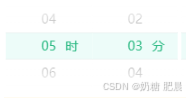
实现一个时间选择器的功能,可以选择小时和分钟:
HTML/Template部分:
<picker-view
  class="sleepPage-time-picker"
  :indicator-style="indicatorStyle"
  :value="timeValue"
  @change="handleTimeChange"
>
  <!-- 第一列:小时选择 -->
  <picker-view-column>
    <view
      v-for="(hour, index) in hours"
      :key="index"
      :class="[
        'sleepPage-time-picker_item',
        { selected: timeValue[0] === index },
      ]"
    >
      {{ hour }}
      <span
        class="sleepPage-time-picker_item-span"
        v-if="timeValue[0] === index"
        >时</span
      >
    </view>
  </picker-view-column>

  <!-- 第二列:分钟选择 -->
  <picker-view-column>
    <view
      v-for="(minute, index) in minutes"
      :key="index"
      :class="[
        'sleepPage-time-picker_item',
        { selected: timeValue[1] === index },
      ]"
    >
      {{ minute }}
      <span
        class="sleepPage-time-picker_item-span"
        v-if="timeValue[1] === index"
        >分</span
      >
    </view>
  </picker-view-column>
</picker-view>
<picker-view>是一个小程序中的组件,用于实现滚动选择器效果。:indicator-style和:value是组件的属性绑定,分别用来设置选择器的样式和当前选择的值。@change是一个事件监听器,当选择器的值发生改变时会触发handleTimeChange方法。
JavaScript部分:
data() {
  return {
    timeValue: [0, 0],  // 默认选中的时间值,[小时索引, 分钟索引]
    indicatorStyle: "height: 30px;background: rgba(237, 252, 249, 1);z-index: 0;",
    hours: [...Array(24).keys()].map((n) => n.toString().padStart(2, "0")),  // 生成小时选项数组
    minutes: [...Array(60).keys()].map((n) => n.toString().padStart(2, "0")),  // 生成分钟选项数组
  };
},
methods: {
  handleTimeChange(e) {
    this.timeValue = e.detail.value;  // 更新选择的时间值
    // 处理选择后的逻辑,例如更新界面显示的时间
    console.log(
      "Selected Time:",
      this.hours[this.timeValue[0]],
      ":",
      this.minutes[this.timeValue[1]]
    );
  },
}
data()中定义了组件的数据状态,包括timeValue表示当前选择的小时和分钟的索引,hours和minutes分别是小时和分钟的选项数组。handleTimeChange(e)方法是一个事件处理器,用来响应选择器数值改变事件。它更新timeValue并可以执行相应的逻辑,例如打印或更新界面上显示的选择结果。
CSS部分:
.sleepPage-time-picker-box {
  display: flex;
  margin-bottom: 10px;
}
.sleepPage-time-picker {
  height: 90px;  /* 设置选择器的高度 */
  width: 50%;  /* 设置选择器的宽度 */
  margin: 2px;
}
.selected {
  color: rgba(40, 184, 129, 1);  /* 设置选中项的文字颜色 */
}
.sleepPage-time-picker_item {
  text-align: center;
  height: 30px;
  line-height: 30px;
  position: relative;
}
.sleepPage-time-picker_item-span {
  padding-left: 10px;
  position: absolute;
  right: 15px;
}
- CSS 部分定义了选择器和其子元素的样式,包括选择器的整体布局和每个选项的样式,以及选中项的特殊样式。
完整代码
     <picker-view
          class="sleepPage-time-picker"
          :indicator-style="indicatorStyle"
          :value="timeValue"
          @change="handleTimeChange"
        >
          <picker-view-column>
            <view
              v-for="(hour, index) in hours"
              :key="index"
              :class="[
                'sleepPage-time-picker_item',
                { selected: timeValue[0] === index },
              ]"
            >
              {{ hour }}
              <span
                class="sleepPage-time-picker_item-span"
                v-if="timeValue[0] === index"
                >时</span
              >
            </view>
          </picker-view-column>
          <picker-view-column>
            <view
              v-for="(minute, index) in minutes"
              :key="index"
              :class="[
                'sleepPage-time-picker_item',
                { selected: timeValue[1] === index },
              ]"
            >
              {{ minute }}
              <span
                class="sleepPage-time-picker_item-span"
                v-if="timeValue[1] === index"
                >分</span
              >
            </view>
          </picker-view-column>
        </picker-view>
      timeValue: [0, 0],
      indicatorStyle:
        "height: 30px;background: rgba(237, 252, 249, 1);z-index: 0;",
      hours: [...Array(24).keys()].map((n) => n.toString().padStart(2, "0")),
      minutes: [...Array(60).keys()].map((n) => n.toString().padStart(2, "0")),


    handleTimeChange(e) {
      this.timeValue = e.detail.value;
      // 这里可以处理时间选择后的逻辑,例如更新界面显示的时间
      console.log(
        "Selected Time:",
        this.hours[this.timeValue[0]],
        ":",
        this.minutes[this.timeValue[1]]
      );
    },


  .sleepPage-time-picker-box {
    display: flex;
margin-bottom: 10px;
    .sleepPage-time-picker {
      // height: 300px;
      height: 90px;
      width: 50%;
      margin: 2px;
    }
    .selected {
      color: rgba(40, 184, 129, 1);
    }

    .sleepPage-time-picker_item {
      text-align: center;
      height: 30px;
      line-height: 30px;
      position: relative;
    }
    .sleepPage-time-picker_item-span {
      padding-left: 10px;
      position: absolute;
      right: 15px;
    }
  }
您好,我是肥晨。
欢迎关注我获取前端学习资源,日常分享技术变革,生存法则;行业内幕,洞察先机。
原文地址:https://blog.csdn.net/weixin_48998573/article/details/140685754
免责声明:本站文章内容转载自网络资源,如本站内容侵犯了原著者的合法权益,可联系本站删除。更多内容请关注自学内容网(zxcms.com)!