react+canvas实现刮刮乐效果
话不多说,直接看代码吧
import { useEffect } from 'react';
import styles from './index.less';
export default function Canvas() {
function init() {
let gj = document.querySelector('.gj');
let jp = document.querySelector('#jp') as HTMLElement;
let canvas = document.querySelector('#mask') as HTMLCanvasElement;
let ctx = canvas?.getContext('2d') as any;
// 遮罩层mask设置
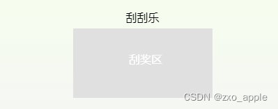
ctx.fillStyle = '#e0e0e0';
ctx.fillRect(0, 0, 200, 100);
ctx.fillStyle = '#ffffff';
ctx.font = '16px 微软雅黑';
ctx?.fillText('刮奖区', 80, 50); // 文字在框中位置
// 奖品部分逻辑
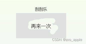
let arr = ['一等奖', '二等奖', '三等奖', '再来一次'];
let randomNum = Math.random() * 100;
if (randomNum < 10) {
jp.innerHTML = arr[0];
} else if (randomNum < 30) {
jp.innerHTML = arr[1];
} else if (randomNum < 60) {
jp.innerHTML = arr[2];
} else {
jp.innerHTML = arr[3];
}
// 绘图部分
let isDraw = false;
canvas.onmousedown = () => (isDraw = true);
canvas.onmouseup = () => (isDraw = false);
canvas.onmousemove = (e) => {
if (isDraw) {
writeText(ctx, e, gj);
}
};
}
function writeText(ctx: any, e: MouseEvent, gj: HTMLElement) {
ctx?.beginPath();
let x = e.pageX - gj?.getBoundingClientRect().left;
let y = e.pageY - gj?.getBoundingClientRect().top;
ctx.globalCompositeOperation = 'destination-out'; // !!! 在后绘制的图形上方显示先绘制的图形, 相交部分由先绘制图形的填充(颜色,渐变,纹理)覆盖
ctx?.closePath();
ctx?.arc(x, y, 10, 0, Math.PI * 2);
ctx?.fill();
}
useEffect(() => {
init();
}, []);
return (
<div className={styles.container}>
<div className=" text-center text-[16px]">刮刮乐</div>
<div className="gj mt-4 cursor-pointer">
<div id="jp"></div>
<canvas id="mask" width={200} height={100}></canvas>
</div>
</div>
);
}
index.less部分
.container {
  padding: 20px;
  box-shadow: 4px 4px 4px 4px #eee;
  overflow: hidden;
    .gj {
      margin: 16px auto;
      width: 200px;
      height: 100px;
      #jp {
        position: absolute;
        top: 50%;
        left: 50%;
        transform: translate(-50%, -50%);
        font-size: 20px;
        color: black;
      }
      #mask {
        position: absolute;
        top: 50%;
        left: 50%;
        transform: translate(-50%, -50%);
      }
    }
}
原文地址:https://blog.csdn.net/zxo_apple/article/details/136229149
免责声明:本站文章内容转载自网络资源,如本站内容侵犯了原著者的合法权益,可联系本站删除。更多内容请关注自学内容网(zxcms.com)!