解决CSS中鼠标移入到某个元素其子元素被遮挡的问题
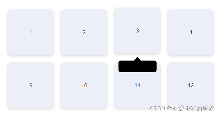
我们在开发中经常遇到一种场景,就是给元素加提示信息,就是鼠标移入到盒子上面时,会出现提示信息这一功能,如果我们给盒子加了hover,当鼠标移入到盒子上时,让他往上移动5px,即transform: translateY(-5px), 同时还让提示信息展示出来,此时受到transform的影响,提示信息会被父盒子遮挡住。代码如下:
<template>
  <div class="container">
    <div
      class="item"
      v-for="item in 30"
      @mouseenter="showTooltip"
      @mouseleave="hideTooltip"
    >
      <div class="tooltip"></div>
      <span>{{ item }}</span>
    </div>
  </div>
</template>

<style>
.container {
  display: flex;
  flex-wrap: wrap;
  width: 1145px;
  margin: 0 auto;
  padding: 10px;
}
.item {
  position: relative;
  display: flex;
  justify-content: center;
  align-items: center;
  width: 120px;
  height: 120px;
  background-color: #eceff7;
  border-radius: 10px;
  margin: 10px;
  box-shadow: 0 3px 5px 2px rgba(0, 0, 0, 0.1);
  cursor: pointer;
  transition: all 0.5s ease;;
}

.item .tooltip {
  display: none;
  width: 100px;
  height: 30px;
  background-color: #000;
  border-radius: 6px;
  position: absolute;
  bottom: -50px;
  z-index: 10;
}
.item .tooltip::after {
  position: absolute;
  left: 0;
  top: -25px;
  width: 0;
  height: 0;
  left: 50%;
  transform: translateX(-50%);
  border-left: 12px solid transparent;
  border-right: 12px solid transparent;
  border-top: 15px solid transparent;
  border-bottom: 15px solid #000;
  content: "";
  z-index: 20px;
}
.item:hover {
  transform: translateY(-5px);
}
.item:hover .tooltip {
  display: block;
}
</style>

我们可以看到,我们给tooltip设置了z-index值为10,但是黑色提示信息依然被挡住了,原因时当hover时,执行了transform, 会改变元素的层级,
此时我们只需要给 .item:hover 加上一句 z-index: 1, 保证hover的时候,层级比item更低,就能解决这个问题。
<template>
  <div class="container">
    <div
      class="item"
      v-for="item in 30"
      @mouseenter="showTooltip"
      @mouseleave="hideTooltip"
    >
      <div class="tooltip"></div>
      <span>{{ item }}</span>
    </div>
  </div>
</template>
<style>
.container {
  display: flex;
  flex-wrap: wrap;
  width: 1145px;
  margin: 0 auto;
  padding: 10px;
}
.item {
  position: relative;
  display: flex;
  justify-content: center;
  align-items: center;
  width: 120px;
  height: 120px;
  background-color: #eceff7;
  border-radius: 10px;
  margin: 10px;
  box-shadow: 0 3px 5px 2px rgba(0, 0, 0, 0.1);
  cursor: pointer;
  transition: all 0.5s ease;;
}

.item .tooltip {
  display: none;
  width: 100px;
  height: 30px;
  background-color: #000;
  border-radius: 6px;
  position: absolute;
  bottom: -50px;
  z-index: 10;
}
.item .tooltip::after {
  position: absolute;
  left: 0;
  top: -25px;
  width: 0;
  height: 0;
  left: 50%;
  transform: translateX(-50%);
  border-left: 12px solid transparent;
  border-right: 12px solid transparent;
  border-top: 15px solid transparent;
  border-bottom: 15px solid #000;
  content: "";
  z-index: 20px;
}
.item:hover {
  z-index: 1; /* 保证hover的时候z-index层级更低 */
  transform: translateY(-5px);
}
.item:hover .tooltip {
  display: block;
}
</style>
此时我们再看效果:
原文地址:https://blog.csdn.net/m0_46219714/article/details/137671323
免责声明:本站文章内容转载自网络资源,如本站内容侵犯了原著者的合法权益,可联系本站删除。更多内容请关注自学内容网(zxcms.com)!