Css提高——flex布局及其相关属性
目录:
3.2、justify-content 设置主轴上的子元素排列方式
3.4、align-items 设置侧轴上的子元素排列方式(单行 )
3.5、align-content 设置侧轴上的子元素的排列方式(多行)
3.6、flex-flow(flex-direction 和 flex-wrap 属性的复合属性
4.2、align-self 控制子项自己在侧轴上的排列方式
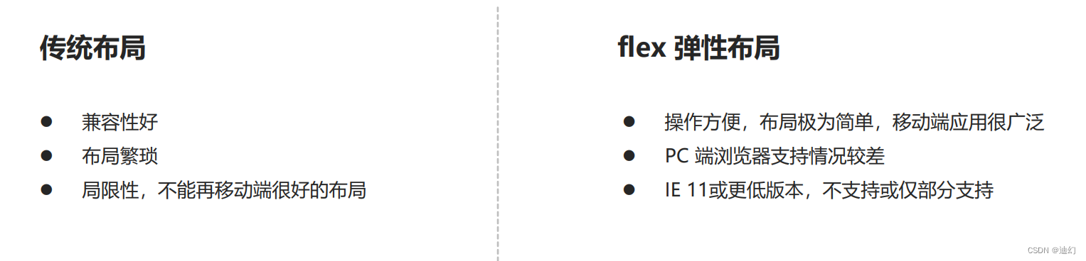
1、传统布局与flex布局的区别
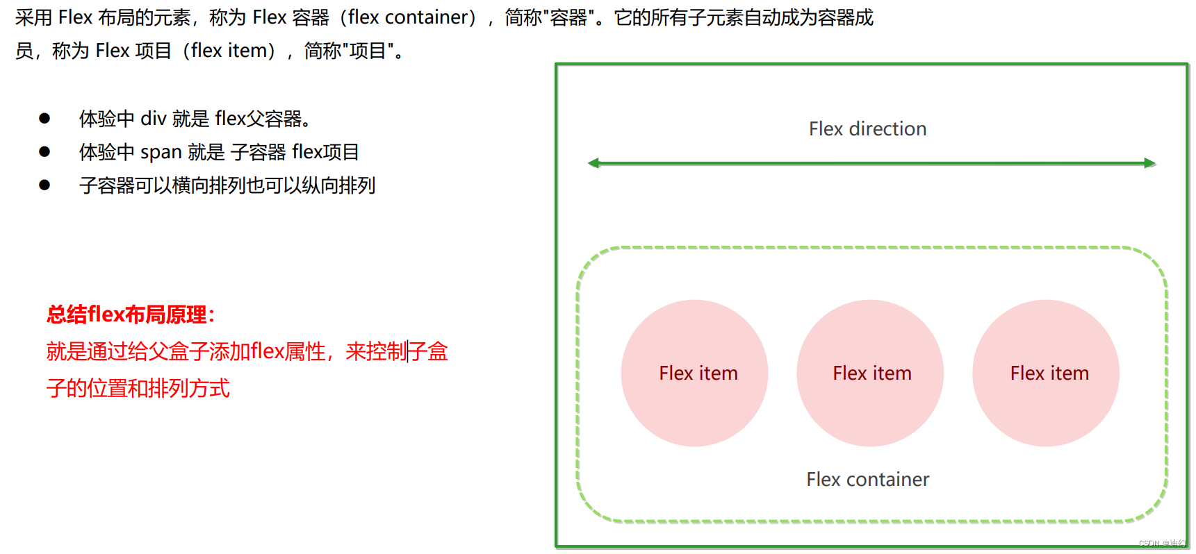
2、flex的布局原理
flex 是 flexible Box 的缩写,意为"弹性布局",用来为盒状模型提供最大的灵活性,任何一个容器都可以 指定为 flex 布局。
- 当我们为父盒子设为 flex 布局以后,子元素的 float、clear 和 vertical-align 属性将失效。
- 伸缩布局 = 弹性布局 = 伸缩盒布局 = 弹性盒布局 =flex布局
3、flex常见的父项属性
- flex-direction:设置主轴的方向
- justify-content:设置主轴上的子元素排列方式
- flex-wrap:设置子元素是否换行
- align-content:设置侧轴上的子元素的排列方式(多行)
- align-items:设置侧轴上的子元素排列方式(单行)
- flex-flow:复合属性,相当于同时设置了 flex-direction 和 flex-wrap
3.1、flex-direction :设置主轴的方向
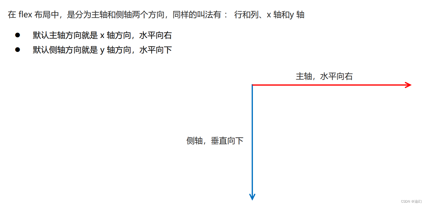
1、主轴和侧轴的概念
2、flex-direction的属性值

3、例子
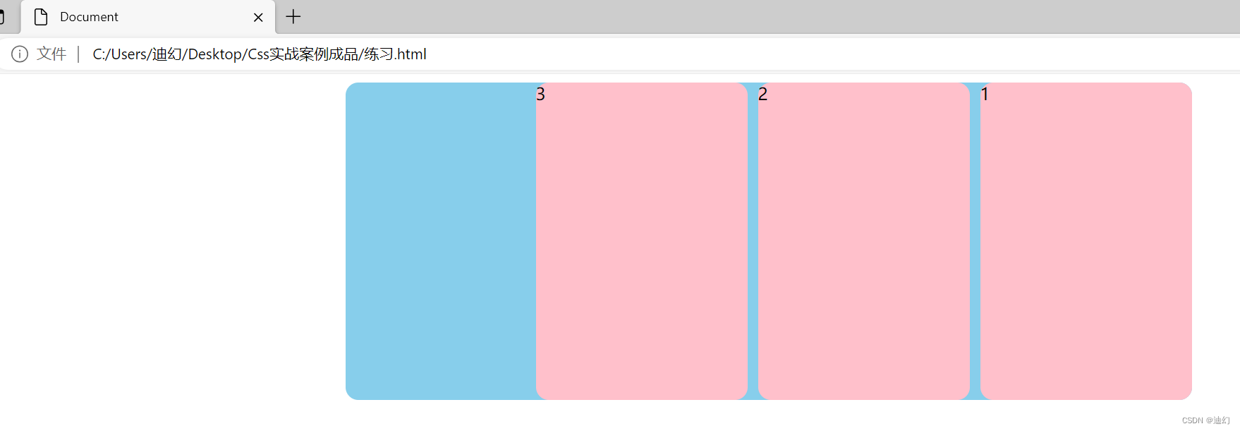
如果我想要将flex的子元素从右往左排列的话,则需要对父元素添加flex-direction: row-reverse;属性
1、代码:
<!DOCTYPE html>
<html lang="en">

<head>
    <meta charset="UTF-8">
    <meta name="viewport" content="width=device-width, initial-scale=1.0">
    <title>Document</title>
    <style>
        .main {
            width: 800px;
            height: 600px;

            margin: 0 auto;
            border-radius: 12px;

            background-color: skyblue;

            display: flex;

            flex-direction: row-reverse;

        }

        span {
            width: 200px;
            margin-left: 10px;
            height: 100%;

            border-radius: 12px;

            background-color: pink;


        }
    </style>
</head>

<body>
    <div class="main">
        <span>1</span>
        <span>2</span>
        <span>3</span>
    </div>
</body>

</html>
2、 效果图
3.2、justify-content 设置主轴上的子元素排列方式
1、justify-content 的属性值:

2、例子:
2、代码:
<!DOCTYPE html>
<html lang="en">

<head>
    <meta charset="UTF-8">
    <meta name="viewport" content="width=device-width, initial-scale=1.0">
    <meta http-equiv="X-UA-Compatible" content="ie=edge">
    <title>Document</title>
    <style>
        div {
            display: flex;
            width: 800px;
            height: 400px;
            background-color: pink;
            /* 我们现在的主轴是y轴 */
            flex-direction: column;
            /* justify-content: center; */
            justify-content: space-between;
        }

        div span {
            width: 150px;
            height: 100px;
            background-color: purple;
        }
    </style>
</head>

<body>
    <div>
        <span>1</span>
        <span>2</span>
        <span>3</span>
    </div>
</body>

</html>
3、效果图:
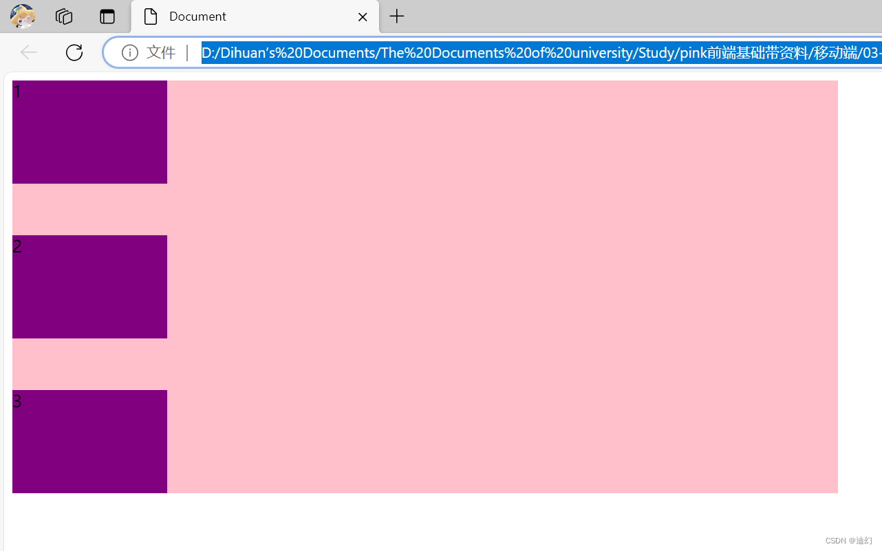
3.3、flex-wrap 设置子元素是否换行
1、flex-wrap 属性值
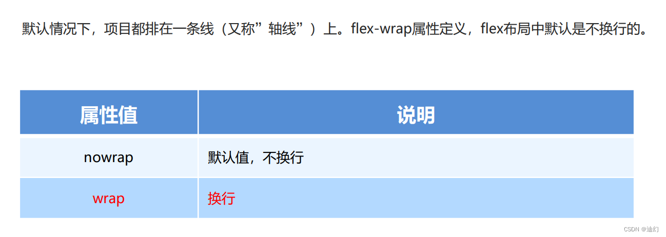
2、例子
1、代码
<!DOCTYPE html>
<html lang="en">

<head>
    <meta charset="UTF-8">
    <meta name="viewport" content="width=device-width, initial-scale=1.0">
    <meta http-equiv="X-UA-Compatible" content="ie=edge">
    <title>Document</title>
    <style>
        div {
            display: flex;
            width: 600px;
            height: 400px;
            background-color: pink;
            /* flex布局中,默认的子元素是不换行的, 如果装不开,会缩小子元素的宽度,放到父元素里面  */
            /* flex-wrap: nowrap; */
            flex-wrap: wrap;
        }

        div span {
            width: 150px;
            height: 100px;
            background-color: purple;
            color: #fff;
            margin: 10px;
        }
    </style>
</head>

<body>
    <div>
        <span>1</span>
        <span>2</span>
        <span>3</span>
        <span>4</span>
        <span>5</span>
    </div>
</body>

</html>
2、效果图

3.4、align-items 设置侧轴上的子元素排列方式(单行 )
1、align-items 属性值

2、例子
1、代码:
<!DOCTYPE html>
<html lang="en">

<head>
    <meta charset="UTF-8">
    <meta name="viewport" content="width=device-width, initial-scale=1.0">
    <meta http-equiv="X-UA-Compatible" content="ie=edge">
    <title>Document</title>
    <style>
        div {
            display: flex;
            width: 800px;
            height: 400px;
            background-color: pink;
            /* 默认的主轴是 x 轴 row */
            flex-direction: column;
            justify-content: center;
            /* 我们需要一个侧轴居中 */
            /* 拉伸,但是子盒子不要给高度 */
            /* align-items: stretch; */
            align-items: center;
            /* align-content: center; */
        }

        div span {
            width: 150px;
            height: 100px;
            background-color: purple;
            color: #fff;
            margin: 10px;
        }
    </style>
</head>

<body>
    <div>
        <span>1</span>
        <span>2</span>
        <span>3</span>
    </div>
</body>

</html>
2、效果图:

3.5、align-content 设置侧轴上的子元素的排列方式(多行)
1、align-content属性值
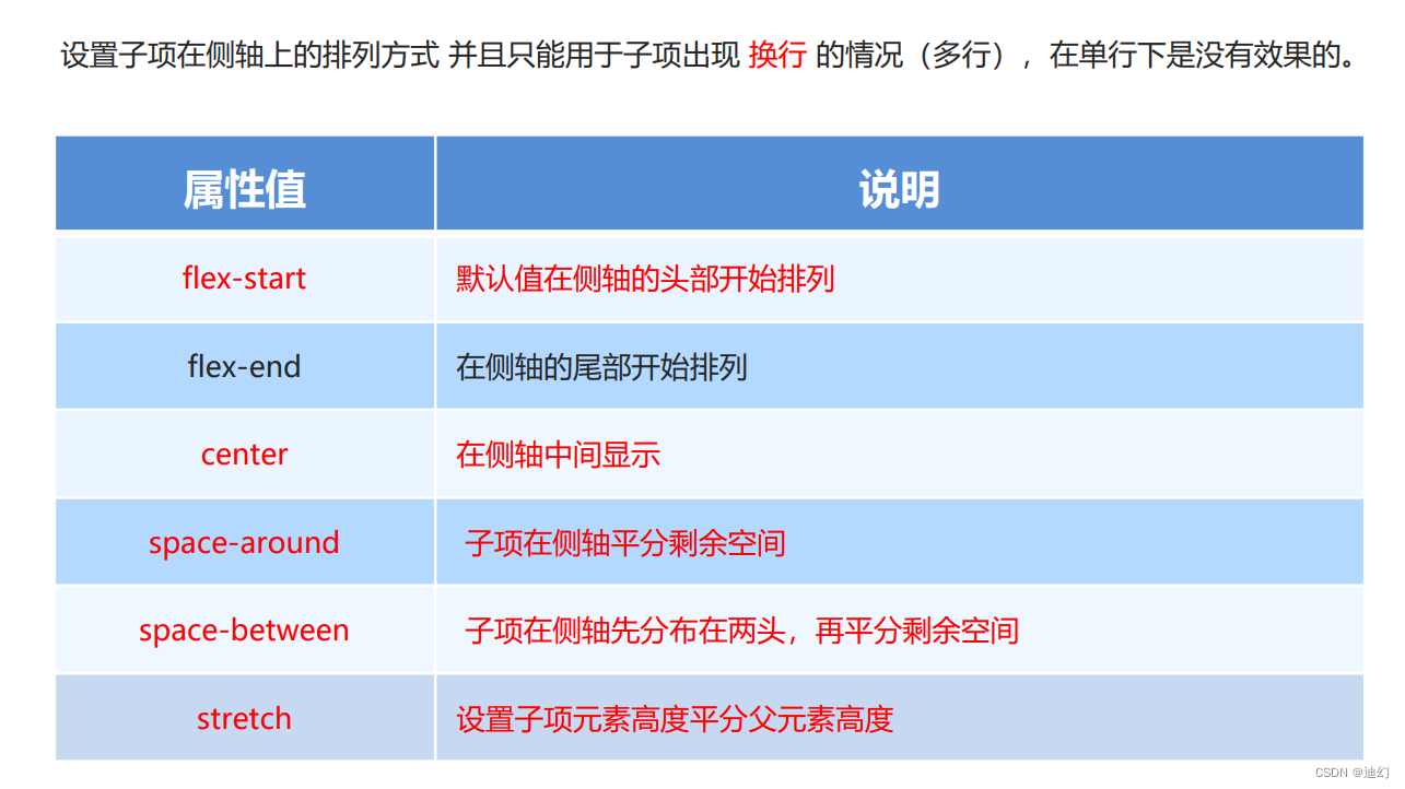
2、例子
1、代码
<!DOCTYPE html>
<html lang="en">

<head>
    <meta charset="UTF-8">
    <meta name="viewport" content="width=device-width, initial-scale=1.0">
    <meta http-equiv="X-UA-Compatible" content="ie=edge">
    <title>Document</title>
    <style>
        div {
            display: flex;
            width: 800px;
            height: 400px;
            background-color: pink;
            /* 换行 */
            flex-wrap: wrap;
            /* 因为有了换行,此时我们侧轴上控制子元素的对齐方式我们用 align-content */
            /* align-content: flex-start; */
            /* align-content: center; */
            /* align-content: space-between; */
            align-content: space-around;
        }

        div span {
            width: 150px;
            height: 100px;
            background-color: purple;
            color: #fff;
            margin: 10px;
        }
    </style>
</head>

<body>
    <div>
        <span>1</span>
        <span>2</span>
        <span>3</span>
        <span>4</span>
        <span>5</span>
        <span>6</span>
    </div>
</body>

</html>
2、效果图:

3.6、flex-flow(flex-direction 和 flex-wrap 属性的复合属性)
1、flex-flow 属性值

4、flex常见的子项属性
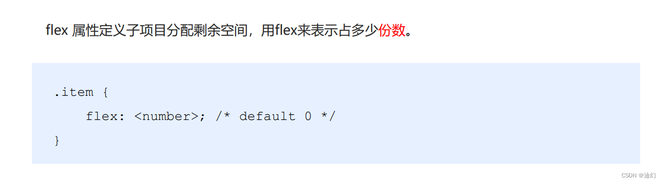
4.1、flex
1、flex属性
2、例子
1、代码:
<!DOCTYPE html>
<html lang="en">

<head>
    <meta charset="UTF-8">
    <meta name="viewport" content="width=device-width, initial-scale=1.0">
    <title>Document</title>
    <style>
        .main {
            width: 800px;
            height: 400px;

            background-color: skyblue;
            margin: 0 auto;
            border-radius: 12px;

            display: flex;
        }

        span {
            flex: 1;
            background-color: green;
            height: 100px;
            border-radius: 12px;
            margin-left: 10px;
        }

        .main span:nth-child(2) {
            flex: 2;
            background-color: blue;
            height: 100px;
            border-radius: 12px;
            margin-left: 10px;
        }
    </style>
</head>

<body>
    <div class="main">
        <span>1</span>
        <span>2</span>
        <span>3</span>
    </div>
</body>

</html>
2、效果图

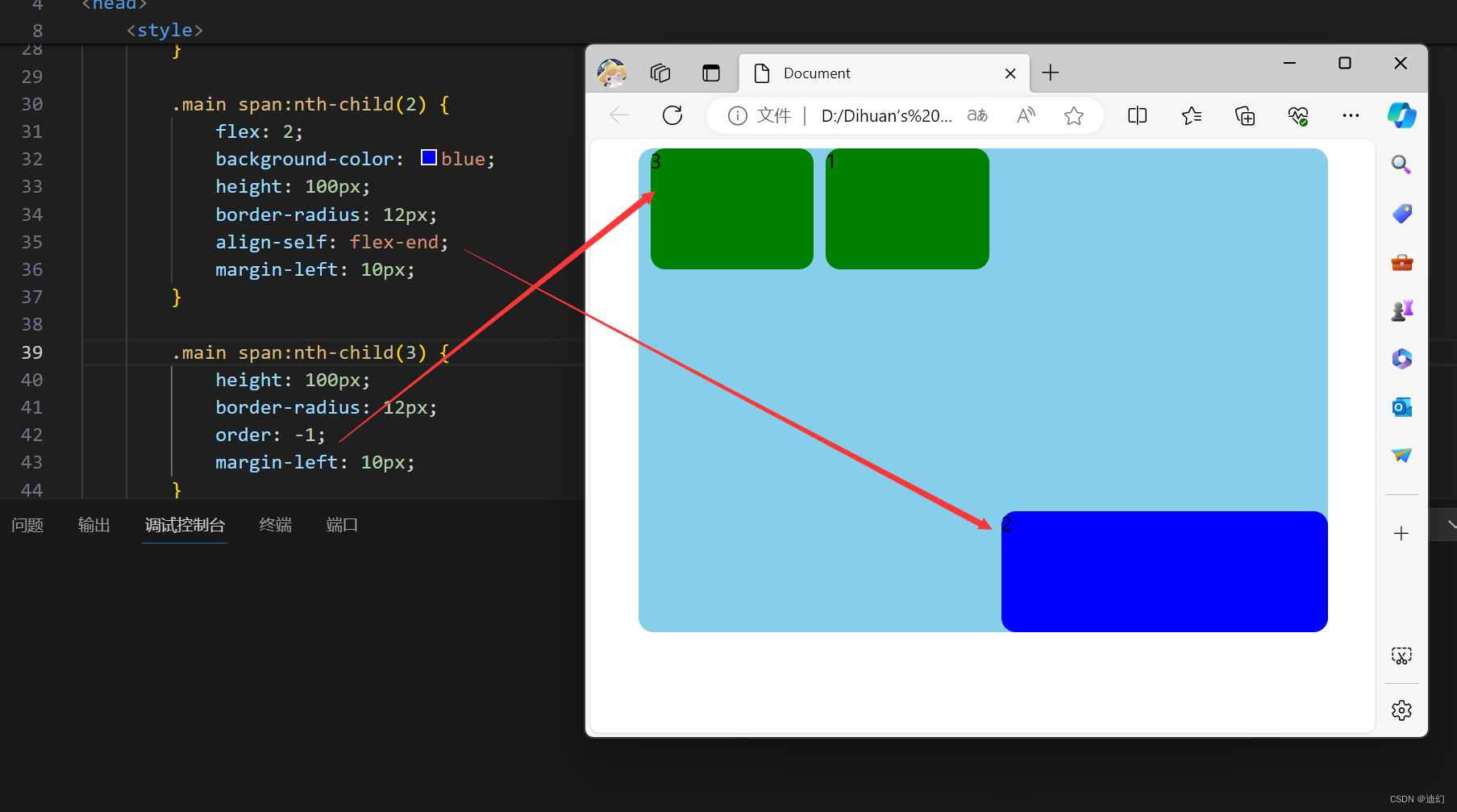
4.2、align-self 控制子项自己在侧轴上的排列方式&
1、定义
align-self
order:

2、例子:
1、代码:
<!DOCTYPE html>
<html lang="en">

<head>
    <meta charset="UTF-8">
    <meta name="viewport" content="width=device-width, initial-scale=1.0">
    <title>Document</title>
    <style>
        .main {
            width: 90%;
            height: 400px;

            background-color: skyblue;
            margin: 0 auto;
            border-radius: 12px;


            display: flex;
            flex-direction: row;
        }

        span {
            flex: 1;
            background-color: green;
            height: 100px;
            border-radius: 12px;
            margin-left: 10px;
        }

        .main span:nth-child(2) {
            flex: 2;
            background-color: blue;
            height: 100px;
            border-radius: 12px;
            align-self: flex-end;
            margin-left: 10px;
        }

        .main span:nth-child(3) {
            height: 100px;
            border-radius: 12px;
            order: -1;
            margin-left: 10px;
        }
    </style>
</head>

<body>
    <div class="main">
        <span>1</span>
        <span>2</span>
        <span>3</span>
    </div>
</body>

</html>
2、效果图:
原文地址:https://blog.csdn.net/qq_38965505/article/details/136700738
免责声明:本站文章内容转载自网络资源,如本站内容侵犯了原著者的合法权益,可联系本站删除。更多内容请关注自学内容网(zxcms.com)!