【vue前端项目实战案例】之Vue仿饿了么App
本文将介绍一款仿“饿了么”商家页面的App。该案例是基于 Vue2.0 + Vue Router + webpack + ES6
等技术栈实现的一款外卖类App,适合初学者进行学习。
项目源码下载链接在文章末尾
1 项目概述
该项目是一款仿“饿了么”商家页面的外卖类App,主要有以下功能。
- 商品导航。
- 商品列表使用手势上下滑动。
- 购物车中商品的添加和删除操作。
- 点击商品查看详情。
- 商家评价。
- 商家信息。
1.1 开发环境
首先需要安装Node.js 12以上的版本,因为Node.js中已经继承了NPM,所以无需在单独安装NPM。然后再安装Vue脚手架(Vue-CLI)以及创建项目。
项目的调试使用Google Chrome浏览器的控制台进行,在浏览器中按下F12键,然后单击“切换设备工具栏”,进入移动端的调试界面,可以选择相应的设备进行调试,效果如图1 所示。

图 1 项目效果图
1.2 项目结构
项目结构如图2所示,其中src文件夹是项目的源文件目录,src文件夹下的项目结构如图3所示。

图2 项目结构

图3 src文件夹
项目结构中主要文件说明如下。
- dist:项目打包后的静态文件存放目录。
- node_modules:项目依赖管理目录。
- public:项目的静态文件存放目录,也是本地服务器的根目录。
- src:项目源文件存放目录。
- package.json:项目npm配置文件。
src文件夹目录说明如下。
- assets:静态资源文件存放目。
- components:公共组件存放目录。
- router:路由配置文件存放目录。
- store:状态管理配置存放目录。
- views:视图组件存放目录。
- App.vue:项目的根组件。
- main.js:项目的入口文件。
2 入口文件
项目的入口文件有 index.html、main.js和App.vue三个文件,这些入口文件的具体内容介绍如下。
2.1 项目入口页面
index.html是项目默认的主渲染页面文件,主要用于Vue实例挂载点的声明与DOM渲染。代码如下:
<!DOCTYPE html>
<html lang="en">
  <head>
    <meta charset="utf-8">
    <meta http-equiv="X-UA-Compatible" content="IE=edge">
    <meta name="viewport" content="width=device-width,initial-scale=1.0">
    <link rel="icon" href="<%= BASE_URL %>favicon.ico">
    <title><%= htmlWebpackPlugin.options.title %></title>
  </head>
  <body>
    <div id="app"></div>
  </body>
</html>
2.2 程序入口文件
main.js是程序的入口文件,主要用于加载各种公共组件和初始化Vue实例。本项目中的路由设置和引用的Vant UI组件库就是在该文件中定义的。代码如下:
import Vue from 'vue'
import App from './App.vue'
import './cube-ui'
import './register'

import 'common/stylus/index.styl'

Vue.config.productionTip = false

new Vue({
  render: h => h(App)
}).$mount('#app')
本项目案例使用了 Cube UI 组件库,在项目src目录下创建 cube-ui.js 文件,用于引入项目中要用到的组件,代码如下:
import Vue from 'vue'
import {
  Style,
  TabBar,
  Popup,
  Dialog,
  Scroll,
  Slide,
  ScrollNav,
  ScrollNavBar
} from 'cube-ui'

Vue.use(TabBar)
Vue.use(Popup)
Vue.use(Dialog)
Vue.use(Scroll)
Vue.use(Slide)
Vue.use(ScrollNav)
Vue.use(ScrollNavBar)
2.3 组件入口文件
App.vue是项目的根组件,所有的页面都是在App.vue下面切换的,所有的页面组件都是App.vue的子组件。在App.vue组件内只需要使用 组件作为占位符,就可以实现各个页面的引入。代码如下:
<template>
  <div id="app" @touchmove.prevent>
    <v-header :seller="seller"></v-header>
    <div class="tab-wrapper">
      <tab :tabs="tabs"></tab>
    </div>
  </div>
</template>

<script>
  import qs from 'query-string'
  import { getSeller } from 'api'
  import VHeader from 'components/v-header/v-header'
  import Goods from 'components/goods/goods'
  import Ratings from 'components/ratings/ratings'
  import Seller from 'components/seller/seller'
  import Tab from 'components/tab/tab'

  export default {
    data() {
      return {
        seller: {
          id: qs.parse(location.search).id
        }
      }
    },
    computed: {
      tabs() {
        return [
          {
            label: '商品',
            component: Goods,
            data: {
              seller: this.seller
            }
          },
          {
            label: '评论',
            component: Ratings,
            data: {
              seller: this.seller
            }
          },
          {
            label: '商家',
            component: Seller,
            data: {
              seller: this.seller
            }
          }
        ]
      }
    },
    created() {
      this._getSeller()
    },
    methods: {
      _getSeller() {
        getSeller({
          id: this.seller.id
        }).then((seller) => {
          this.seller = Object.assign({}, this.seller, seller)
        })
      }
    },
    components: {
      Tab,
      VHeader
    }
  }
</script>

<style lang="stylus" scoped>
  #app
    .tab-wrapper
      position: fixed
      top: 136px
      left: 0
      right: 0
      bottom: 0
</style>
3 项目组件
项目中所有页面组件都在views文件夹中定义,具体组件内容介绍如下。
3.1 头部组件
头部组件主要展示商家的基本信息,如图4所示。

图 4 头部组件效果
代码如下:
<template>
  <div class="header" @click="showDetail">
    <div class="content-wrapper">
      <div class="avatar">
        <img width="64" height="64" :src="seller.avatar">
      </div>
      <div class="content">
        <div class="title">
          <span class="brand"></span>
          <span class="name">{{seller.name}}</span>
        </div>
        <div class="description">
          {{seller.description}}/{{seller.deliveryTime}}分钟送达
        </div>
        <div v-if="seller.supports" class="support">
          <support-ico :size=1 :type="seller.supports[0].type"></support-ico>
          <span class="text">{{seller.supports[0].description}}</span>
        </div>
      </div>
      <div v-if="seller.supports" class="support-count">
        <span class="count">{{seller.supports.length}}个</span>
        <i class="icon-keyboard_arrow_right"></i>
      </div>
    </div>
    <div class="bulletin-wrapper">
      <span class="bulletin-title"></span><span class="bulletin-text">{{seller.bulletin}}</span>
      <i class="icon-keyboard_arrow_right"></i>
    </div>
    <div class="background">
      <img :src="seller.avatar" width="100%" height="100%">
    </div>
  </div>
</template>

<script type="text/ecmascript-6">
  import SupportIco from 'components/support-ico/support-ico'

  export default {
    name: 'v-header',
    props: {
      seller: {
        type: Object,
        default() {
          return {}
        }
      }
    },
    methods: {
      showDetail() {
        this.headerDetailComp = this.headerDetailComp || this.$createHeaderDetail({
          $props: {
            seller: 'seller'
          }
        })
        this.headerDetailComp.show()
      }
    },
    components: {
      SupportIco
    }
  }
</script>

<style lang="stylus" rel="stylesheet/stylus">
  @import "~common/stylus/mixin"
  @import "~common/stylus/variable"

  .header
    position: relative
    overflow: hidden
    color: $color-white
    background: $color-background-ss
    .content-wrapper
      position: relative
      display: flex
      align-items: center
      padding: 24px 12px 18px 24px
      .avatar
        flex: 0 0 64px
        width: 64px
        margin-right: 16px
        img
          border-radius: 2px
      .content
        flex: 1
        .title
          display: flex
          align-items: center
          margin-bottom: 8px
          .brand
            width: 30px
            height: 18px
            bg-image('brand')
            background-size: 30px 18px
            background-repeat: no-repeat
          .name
            margin-left: 6px
            font-size: $fontsize-large
            font-weight: bold
        .description
          margin-bottom: 8px
          line-height: 12px
          font-size: $fontsize-small
        .support
          display: flex
          align-items: center
          .support-ico
            margin-right: 4px
          .text
            line-height: 12px
            font-size: $fontsize-small-s

      .support-count
        position: absolute
        right: 12px
        bottom: 14px
        display: flex
        align-items: center
        padding: 0 8px
        height: 24px
        line-height: 24px
        text-align: center
        border-radius: 14px
        background: $color-background-sss
        .count
          font-size: $fontsize-small-s
        .icon-keyboard_arrow_right
          margin-left: 2px
          line-height: 24px
          font-size: $fontsize-small-s

    .bulletin-wrapper
      position: relative
      display: flex
      align-items: center
      height: 28px
      line-height: 28px
      padding: 0 8px
      background: $color-background-sss
      .bulletin-title
        flex: 0 0 22px
        width: 22px
        height: 12px
        margin-right: 4px
        bg-image('bulletin')
        background-size: 22px 12px
        background-repeat: no-repeat
      .bulletin-text
        flex: 1
        white-space: nowrap
        overflow: hidden
        text-overflow: ellipsis
        font-size: $fontsize-small-s
      .icon-keyboard_arrow_right
        flex: 0 0 10px
        width: 10px
        font-size: $fontsize-small-s
    .background
      position: absolute
      top: 0
      left: 0
      width: 100%
      height: 100%
      z-index: -1
      filter: blur(10px)
</style>
3.2 商品标签栏与侧边导航组件
在商家信息下方,通过商品标签栏实现商品、评价和商家信息的切换,在商品标签中,通过侧边导航实现对商品列表的滚动和分类展示等功能。效果如图5所示。
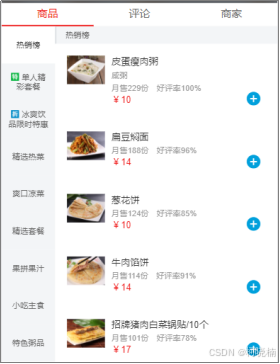
图 5 商品标签栏效果
代码如下:
<template>
  <div class="tab">
    <cube-tab-bar
      :useTransition=false
      :showSlider=true
      v-model="selectedLabel"
      :data="tabs"
      ref="tabBar"
      class="border-bottom-1px"
    >
    </cube-tab-bar>
    <div class="slide-wrapper">
      <cube-slide
        :loop=false
        :auto-play=false
        :show-dots=false
        :initial-index="index"
        ref="slide"
        :options="slideOptions"
        @scroll="onScroll"
        @change="onChange"
      >
        <cube-slide-item v-for="(tab,index) in tabs" :key="index">
          <component ref="component" :is="tab.component" :data="tab.data"></component>
        </cube-slide-item>
      </cube-slide>
    </div>
  </div>
</template>

<script>
  export default {
    name: 'tab',
    props: {
      tabs: {
        type: Array,
        default() {
          return []
        }
      },
      initialIndex: {
        type: Number,
        default: 0
      }
    },
    data() {
      return {
        index: this.initialIndex,
        slideOptions: {
          listenScroll: true,
          probeType: 3,
          directionLockThreshold: 0
        }
      }
    },
    computed: {
      selectedLabel: {
        get() {
          return this.tabs[this.index].label
        },
        set(newVal) {
          this.index = this.tabs.findIndex((value) => {
            return value.label === newVal
          })
        }
      }
    },
    mounted() {
      this.onChange(this.index)
    },
    methods: {
      onScroll(pos) {
        const tabBarWidth = this.$refs.tabBar.$el.clientWidth
        const slideWidth = this.$refs.slide.slide.scrollerWidth
        const transform = -pos.x / slideWidth * tabBarWidth
        this.$refs.tabBar.setSliderTransform(transform)
      },
      onChange(current) {
        this.index = current
        const instance = this.$refs.component[current]
        if (instance && instance.fetch) {
          instance.fetch()
        }
      }
    }
  }
</script>

<style lang="stylus" scoped>
  @import "~common/stylus/variable"

  .tab
    display: flex
    flex-direction: column
    height: 100%
    >>> .cube-tab
      padding: 10px 0
    .slide-wrapper
      flex: 1
      overflow: hidden
</style>
3.3 购物车组件
在购物车组件中,当没有任何商品的情况下,无法直接选择,效果如图6所示。当选择商品后,购物车将被激活,效果如图7所示。

图 6 购物车默认状态

图 7 选择商品后的状态
当点击购物车图标后,将显示用户选中的商品,效果如图8所示,在购物车商品列表页面中可以对商品进行加减操作,也可以直接清空购物车。

图8 购物车商品列表
当点击“去结算”按钮时,将弹出购买商品花费的金额提示对话框,效果如图9所示。

图9 提示对话框
具体实现的代码如下。
商品购物车组件 shop-cart.vue 文件代码如下:
<template>
  <div>
    <div class="shopcart">
      <div class="content" @click="toggleList">
        <div class="content-left">
          <div class="logo-wrapper">
            <div class="logo" :class="{'highlight':totalCount>0}">
              <i class="icon-shopping_cart" :class="{'highlight':totalCount>0}"></i>
            </div>
            <div class="num" v-show="totalCount>0">
              <bubble :num="totalCount"></bubble>
            </div>
          </div>
          <div class="price" :class="{'highlight':totalPrice>0}">¥{{totalPrice}}</div>
          <div class="desc">另需配送费¥{{deliveryPrice}}元</div>
        </div>
        <div class="content-right" @click="pay">
          <div class="pay" :class="payClass">
            {{payDesc}}
          </div>
        </div>
      </div>
      <div class="ball-container">
        <div v-for="(ball,index) in balls" :key="index">
          <transition
            @before-enter="beforeDrop"
            @enter="dropping"
            @after-enter="afterDrop">
            <div class="ball" v-show="ball.show">
              <div class="inner inner-hook"></div>
            </div>
          </transition>
        </div>
      </div>
    </div>
  </div>
</template>

<script>
  import Bubble from 'components/bubble/bubble'

  const BALL_LEN = 10
  const innerClsHook = 'inner-hook'

  function createBalls() {
    let balls = []
    for (let i = 0; i < BALL_LEN; i++) {
      balls.push({show: false})
    }
    return balls
  }

  export default {
    name: 'shop-cart',
    props: {
      selectFoods: {
        type: Array,
        default() {
          return []
        }
      },
      deliveryPrice: {
        type: Number,
        default: 0
      },
      minPrice: {
        type: Number,
        default: 0
      },
      sticky: {
        type: Boolean,
        default: false
      },
      fold: {
        type: Boolean,
        default: true
      }
    },
    data() {
      return {
        balls: createBalls(),
        listFold: this.fold
      }
    },
    created() {
      this.dropBalls = []
    },
    computed: {
      totalPrice() {
        let total = 0
        this.selectFoods.forEach((food) => {
          total += food.price * food.count
        })
        return total
      },
      totalCount() {
        let count = 0
        this.selectFoods.forEach((food) => {
          count += food.count
        })
        return count
      },
      payDesc() {
        if (this.totalPrice === 0) {
          return `¥${this.minPrice}元起送`
        } else if (this.totalPrice < this.minPrice) {
          let diff = this.minPrice - this.totalPrice
          return `还差¥${diff}元起送`
        } else {
          return '去结算'
        }
      },
      payClass() {
        if (!this.totalCount || this.totalPrice < this.minPrice) {
          return 'not-enough'
        } else {
          return 'enough'
        }
      }
    },
    methods: {
      toggleList() {
        if (this.listFold) {
          if (!this.totalCount) {
            return
          }
          this.listFold = false
          this._showShopCartList()
          this._showShopCartSticky()
        } else {
          this.listFold = true
          this._hideShopCartList()
        }
      },
      pay(e) {
        if (this.totalPrice < this.minPrice) {
          return
        }
        this.$createDialog({
          title: '支付',
          content: `您需要支付${this.totalPrice}元`
        }).show()
        e.stopPropagation()
      },
      drop(el) {
        for (let i = 0; i < this.balls.length; i++) {
          const ball = this.balls[i]
          if (!ball.show) {
            ball.show = true
            ball.el = el
            this.dropBalls.push(ball)
            return
          }
        }
      },
      beforeDrop(el) {
        const ball = this.dropBalls[this.dropBalls.length - 1]
        const rect = ball.el.getBoundingClientRect()
        const x = rect.left - 32
        const y = -(window.innerHeight - rect.top - 22)
        el.style.display = ''
        el.style.transform = el.style.webkitTransform = `translate3d(0,${y}px,0)`
        const inner = el.getElementsByClassName(innerClsHook)[0]
        inner.style.transform = inner.style.webkitTransform = `translate3d(${x}px,0,0)`
      },
      dropping(el, done) {
        this._reflow = document.body.offsetHeight
        el.style.transform = el.style.webkitTransform = `translate3d(0,0,0)`
        const inner = el.getElementsByClassName(innerClsHook)[0]
        inner.style.transform = inner.style.webkitTransform = `translate3d(0,0,0)`
        el.addEventListener('transitionend', done)
      },
      afterDrop(el) {
        const ball = this.dropBalls.shift()
        if (ball) {
          ball.show = false
          el.style.display = 'none'
        }
      },
      _showShopCartList() {
        this.shopCartListComp = this.shopCartListComp || this.$createShopCartList({
          $props: {
            selectFoods: 'selectFoods'
          },
          $events: {
            leave: () => {
              this._hideShopCartSticky()
            },
            hide: () => {
              this.listFold = true
            },
            add: (el) => {
              this.shopCartStickyComp.drop(el)
            }
          }
        })
        this.shopCartListComp.show()
      },
      _showShopCartSticky() {
        this.shopCartStickyComp = this.shopCartStickyComp || this.$createShopCartSticky({
          $props: {
            selectFoods: 'selectFoods',
            deliveryPrice: 'deliveryPrice',
            minPrice: 'minPrice',
            fold: 'listFold',
            list: this.shopCartListComp
          }
        })
        this.shopCartStickyComp.show()
      },
      _hideShopCartList() {
        const list = this.sticky ? this.$parent.list : this.shopCartListComp
        list.hide && list.hide()
      },
      _hideShopCartSticky() {
        this.shopCartStickyComp.hide()
      }
    },
    watch: {
      fold(newVal) {
        this.listFold = newVal
      },
      totalCount(count) {
        if (!this.fold && count === 0) {
          this._hideShopCartList()
        }
      }
    },
    components: {
      Bubble
    }
  }
</script>

<style lang="stylus" scoped>
  @import "~common/stylus/mixin"
  @import "~common/stylus/variable"

  .shopcart
    height: 100%
    .content
      display: flex
      background: $color-background
      font-size: 0
      color: $color-light-grey
      .content-left
        flex: 1
        .logo-wrapper
          display: inline-block
          vertical-align: top
          position: relative
          top: -10px
          margin: 0 12px
          padding: 6px
          width: 56px
          height: 56px
          box-sizing: border-box
          border-radius: 50%
          background: $color-background
          .logo
            width: 100%
            height: 100%
            border-radius: 50%
            text-align: center
            background: $color-dark-grey
            &.highlight
              background: $color-blue
            .icon-shopping_cart
              line-height: 44px
              font-size: $fontsize-large-xxx
              color: $color-light-grey
              &.highlight
                color: $color-white
          .num
            position: absolute
            top: 0
            right: 0
        .price
          display: inline-block
          vertical-align: top
          margin-top: 12px
          line-height: 24px
          padding-right: 12px
          box-sizing: border-box
          border-right: 1px solid rgba(255, 255, 255, 0.1)
          font-weight: 700
          font-size: $fontsize-large
          &.highlight
            color: $color-white
        .desc
          display: inline-block
          vertical-align: top
          margin: 12px 0 0 12px
          line-height: 24px
          font-size: $fontsize-small-s
      .content-right
        flex: 0 0 105px
        width: 105px
        .pay
          height: 48px
          line-height: 48px
          text-align: center
          font-weight: 700
          font-size: $fontsize-small
          &.not-enough
            background: $color-dark-grey
          &.enough
            background: $color-green
            color: $color-white
    .ball-container
      .ball
        position: fixed
        left: 32px
        bottom: 22px
        z-index: 200
        transition: all 0.4s cubic-bezier(0.49, -0.29, 0.75, 0.41)
        .inner
          width: 16px
          height: 16px
          border-radius: 50%
          background: $color-blue
          transition: all 0.4s linear
</style>
商品购物车列表组件 shop-cart-list.vue 文件代码如下:
<template>
  <transition name="fade">
    <cube-popup
      :mask-closable=true
      v-show="visible"
      @mask-click="maskClick"
      position="bottom"
      type="shop-cart-list"
      :z-index=90
    >
      <transition
        name="move"
        @after-leave="afterLeave"
      >
        <div v-show="visible">
          <div class="list-header">
            <h1 class="title">购物车</h1>
            <span class="empty" @click="empty">清空</span>
          </div>
          <cube-scroll class="list-content" ref="listContent">
            <ul>
              <li
                class="food"
                v-for="(food,index) in selectFoods"
                :key="index"
              >
                <span class="name">{{food.name}}</span>
                <div class="price">
                  <span>¥{{food.price*food.count}}</span>
                </div>
                <div class="cart-control-wrapper">
                  <cart-control @add="onAdd" :food="food"></cart-control>
                </div>
              </li>
            </ul>
          </cube-scroll>
        </div>
      </transition>
    </cube-popup>
  </transition>
</template>

<script>
  import CartControl from 'components/cart-control/cart-control'
  import popupMixin from 'common/mixins/popup'

  const EVENT_SHOW = 'show'
  const EVENT_ADD = 'add'
  const EVENT_LEAVE = 'leave'

  export default {
    name: 'shop-cart-list',
    mixins: [popupMixin],
    props: {
      selectFoods: {
        type: Array,
        default() {
          return []
        }
      }
    },
    created() {
      this.$on(EVENT_SHOW, () => {
        this.$nextTick(() => {
          this.$refs.listContent.refresh()
        })
      })
    },
    methods: {
      onAdd(target) {
        this.$emit(EVENT_ADD, target)
      },
      afterLeave() {
        this.$emit(EVENT_LEAVE)
      },
      maskClick() {
        this.hide()
      },
      empty() {
        this.dialogComp = this.$createDialog({
          type: 'confirm',
          content: '清空购物车?',
          $events: {
            confirm: () => {
              this.selectFoods.forEach((food) => {
                food.count = 0
              })
              this.hide()
            }
          }
        })
        this.dialogComp.show()
      }
    },
    components: {
      CartControl
    }
  }
</script>

<style lang="stylus" scoped>
  @import "~common/stylus/variable"
  .cube-shop-cart-list
    bottom: 48px
    &.fade-enter, &.fade-leave-active
      opacity: 0
    &.fade-enter-active, &.fade-leave-active
      transition: all .3s ease-in-out
    .move-enter, .move-leave-active
      transform: translate3d(0, 100%, 0)
    .move-enter-active, .move-leave-active
      transition: all .3s ease-in-out
    .list-header
      height: 40px
      line-height: 40px
      padding: 0 18px
      background: $color-background-ssss
      .title
        float: left
        font-size: $fontsize-medium
        color: $color-dark-grey
      .empty
        float: right
        font-size: $fontsize-small
        color: $color-blue

    .list-content
      padding: 0 18px
      max-height: 217px
      overflow: hidden
      background: $color-white
      .food
        position: relative
        padding: 12px 0
        box-sizing: border-box
        .name
          line-height: 24px
          font-size: $fontsize-medium
          color: $color-dark-grey
        .price
          position: absolute
          right: 90px
          bottom: 12px
          line-height: 24px
          font-weight: 700
          font-size: $fontsize-medium
          color: $color-red
        .cart-control-wrapper
          position: absolute
          right: 0
          bottom: 6px

</style>
3.4 商品列表组件
在商品标签页面中,商品列表主要展示所有商品的信息,可以点击商品卡片右侧的加号添加购物车。效果如图10所示。

图 10 商品列表效果
代码如下:
<template>
  <div class="goods">
    <div class="scroll-nav-wrapper">
      <cube-scroll-nav
        :side=true
        :data="goods"
        :options="scrollOptions"
        v-if="goods.length"
      >
        <template slot="bar" slot-scope="props">
          <cube-scroll-nav-bar
            direction="vertical"
            :labels="props.labels"
            :txts="barTxts"
            :current="props.current"
          >
            <template slot-scope="props">
              <div class="text">
                <support-ico
                  v-if="props.txt.type>=1"
                  :size=3
                  :type="props.txt.type"
                ></support-ico>
                <span>{{props.txt.name}}</span>
                <span class="num" v-if="props.txt.count">
                  <bubble :num="props.txt.count"></bubble>
                </span>
              </div>
            </template>
          </cube-scroll-nav-bar>
        </template>
        <cube-scroll-nav-panel
          v-for="good in goods"
          :key="good.name"
          :label="good.name"
          :title="good.name"
        >
          <ul>
            <li
              @click="selectFood(food)"
              v-for="food in good.foods"
              :key="food.name"
              class="food-item"
            >
              <div class="icon">
                <img width="57" height="57" :src="food.icon">
              </div>
              <div class="content">
                <h2 class="name">{{food.name}}</h2>
                <p class="desc">{{food.description}}</p>
                <div class="extra">
                  <span class="count">月售{{food.sellCount}}份</span><span>好评率{{food.rating}}%</span>
                </div>
                <div class="price">
                  <span class="now">¥{{food.price}}</span>
                  <span class="old" v-show="food.oldPrice">¥{{food.oldPrice}}</span>
                </div>
                <div class="cart-control-wrapper">
                  <cart-control @add="onAdd" :food="food"></cart-control>
                </div>
              </div>
            </li>
          </ul>
        </cube-scroll-nav-panel>
      </cube-scroll-nav>
    </div>
    <div class="shop-cart-wrapper">
      <shop-cart
        ref="shopCart"
        :select-foods="selectFoods"
        :delivery-price="seller.deliveryPrice"
        :min-price="seller.minPrice"></shop-cart>
    </div>
  </div>
</template>

<script>
  import { getGoods } from 'api'
  import CartControl from 'components/cart-control/cart-control'
  import ShopCart from 'components/shop-cart/shop-cart'
  import Food from 'components/food/food'
  import SupportIco from 'components/support-ico/support-ico'
  import Bubble from 'components/bubble/bubble'

  export default {
    name: 'goods',
    props: {
      data: {
        type: Object,
        default() {
          return {}
        }
      }
    },
    data() {
      return {
        goods: [],
        selectedFood: {},
        scrollOptions: {
          click: false,
          directionLockThreshold: 0
        }
      }
    },
    computed: {
      seller() {
        return this.data.seller
      },
      selectFoods() {
        let foods = []
        this.goods.forEach((good) => {
          good.foods.forEach((food) => {
            if (food.count) {
              foods.push(food)
            }
          })
        })
        return foods
      },
      barTxts() {
        let ret = []
        this.goods.forEach((good) => {
          const {type, name, foods} = good
          let count = 0
          foods.forEach((food) => {
            count += food.count || 0
          })
          ret.push({
            type,
            name,
            count
          })
        })
        return ret
      }
    },
    methods: {
      fetch() {
        if (!this.fetched) {
          this.fetched = true
          getGoods({
            id: this.seller.id
          }).then((goods) => {
            this.goods = goods
          })
        }
      },
      selectFood(food) {
        this.selectedFood = food
        this._showFood()
        this._showShopCartSticky()
      },
      onAdd(target) {
        this.$refs.shopCart.drop(target)
      },
      _showFood() {
        this.foodComp = this.foodComp || this.$createFood({
          $props: {
            food: 'selectedFood'
          },
          $events: {
            add: (target) => {
              this.shopCartStickyComp.drop(target)
            },
            leave: () => {
              this._hideShopCartSticky()
            }
          }
        })
        this.foodComp.show()
      },
      _showShopCartSticky() {
        this.shopCartStickyComp = this.shopCartStickyComp || this.$createShopCartSticky({
          $props: {
            selectFoods: 'selectFoods',
            deliveryPrice: this.seller.deliveryPrice,
            minPrice: this.seller.minPrice,
            fold: true
          }
        })
        this.shopCartStickyComp.show()
      },
      _hideShopCartSticky() {
        this.shopCartStickyComp.hide()
      }
    },
    components: {
      Bubble,
      SupportIco,
      CartControl,
      ShopCart,
      Food
    }
  }
</script>

<style lang="stylus" scoped>
  @import "~common/stylus/mixin"
  @import "~common/stylus/variable"
  .goods
    position: relative
    text-align: left
    height: 100%
    .scroll-nav-wrapper
      position: absolute
      width: 100%
      top: 0
      left: 0
      bottom: 48px
    >>> .cube-scroll-nav-bar
      width: 80px
      white-space: normal
      overflow: hidden
    >>> .cube-scroll-nav-bar-item
      padding: 0 10px
      display: flex
      align-items: center
      height: 56px
      line-height: 14px
      font-size: $fontsize-small
      background: $color-background-ssss
      .text
        flex: 1
        position: relative
      .num
        position: absolute
        right: -8px
        top: -10px
      .support-ico
        display: inline-block
        vertical-align: top
        margin-right: 4px
    >>> .cube-scroll-nav-bar-item_active
      background: $color-white
      color: $color-dark-grey
    >>> .cube-scroll-nav-panel-title
      padding-left: 14px
      height: 26px
      line-height: 26px
      border-left: 2px solid $color-col-line
      font-size: $fontsize-small
      color: $color-grey
      background: $color-background-ssss
    .food-item
      display: flex
      margin: 18px
      padding-bottom: 18px
      position: relative
      &:last-child
        border-none()
        margin-bottom: 0
      .icon
        flex: 0 0 57px
        margin-right: 10px
        img
          height: auto
      .content
        flex: 1
        .name
          margin: 2px 0 8px 0
          height: 14px
          line-height: 14px
          font-size: $fontsize-medium
          color: $color-dark-grey
        .desc, .extra
          line-height: 10px
          font-size: $fontsize-small-s
          color: $color-light-grey
        .desc
          line-height: 12px
          margin-bottom: 8px
        .extra
          .count
            margin-right: 12px
        .price
          font-weight: 700
          line-height: 24px
          .now
            margin-right: 8px
            font-size: $fontsize-medium
            color: $color-red
          .old
            text-decoration: line-through
            font-size: $fontsize-small-s
            color: $color-light-grey
      .cart-control-wrapper
        position: absolute
        right: 0
        bottom: 12px
    .shop-cart-wrapper
      position: absolute
      left: 0
      bottom: 0
      z-index: 50
      width: 100%
      height: 48px
</style>
3.5 商家公告组件
点击头部区域,会弹出商家公告的详细内容,效果如图11所示。

图11 商家公告内容
代码如下:
<template>
  <transition name="fade">
    <div v-show="visible" class="header-detail" @touchmove.stop.prevent>
      <div class="detail-wrapper clear-fix">
        <div class="detail-main">
          <h1 class="name">{{seller.name}}</h1>
          <div class="star-wrapper">
            <star :size="48" :score="seller.score"></star>
          </div>
          <div class="title">
            <div class="line"></div>
            <div class="text">优惠信息</div>
            <div class="line"></div>
          </div>
          <ul v-if="seller.supports" class="supports">
            <li class="support-item" v-for="(item,index) in seller.supports" :key="item.id">
              <support-ico :size=2 :type="seller.supports[index].type"></support-ico>
              <span class="text">{{seller.supports[index].description}}</span>
            </li>
          </ul>
          <div class="title">
            <div class="line"></div>
            <div class="text">商家公告</div>
            <div class="line"></div>
          </div>
          <div class="bulletin">
            <p class="content">{{seller.bulletin}}</p>
          </div>
        </div>
      </div>
      <div class="detail-close" @click="hide">
        <i class="icon-close"></i>
      </div>
    </div>
  </transition>
</template>

<script>
  import popupMixin from 'common/mixins/popup'
  import Star from 'components/star/star'
  import SupportIco from 'components/support-ico/support-ico'

  export default {
    name: 'header-detail',
    mixins: [popupMixin],
    props: {
      seller: {
        type: Object,
        default() {
          return {}
        }
      }
    },
    components: {
      SupportIco,
      Star
    }
  }
</script>

<style lang="stylus" scoped>
  @import "~common/stylus/mixin"
  @import "~common/stylus/variable"

  .header-detail
    position: fixed
    z-index: 100
    top: 0
    left: 0
    width: 100%
    height: 100%
    overflow: auto
    backdrop-filter: blur(10px)
    opacity: 1
    color: $color-white
    background: $color-background-s
    &.fade-enter-active, &.fade-leave-active
      transition: all 0.5s
    &.fade-enter, &.fade-leave-active
      opacity: 0
      background: $color-background
    .detail-wrapper
      display: inline-block
      width: 100%
      min-height: 100%
      .detail-main
        margin-top: 64px
        padding-bottom: 64px
        .name
          line-height: 16px
          text-align: center
          font-size: $fontsize-large
          font-weight: 700
        .star-wrapper
          margin-top: 18px
          padding: 2px 0
          text-align: center
        .title
          display: flex
          width: 80%
          margin: 28px auto 24px auto
          .line
            flex: 1
            position: relative
            top: -6px
            border-bottom: 1px solid rgba(255, 255, 255, 0.2)
          .text
            padding: 0 12px
            font-weight: 700
            font-size: $fontsize-medium

        .supports
          width: 80%
          margin: 0 auto
          .support-item
            display: flex
            align-items: center
            padding: 0 12px
            margin-bottom: 12px
            &:last-child
              margin-bottom: 0
            .support-ico
              margin-right: 6px
            .text
              line-height: 16px
              font-size: $fontsize-small
        .bulletin
          width: 80%
          margin: 0 auto
          .content
            padding: 0 12px
            line-height: 24px
            font-size: $fontsize-small
    .detail-close
      position: relative
      width: 30px
      height: 30px
      margin: -64px auto 0 auto
      clear: both
      font-size: $fontsize-large-xxxx
</style>
3.6 评价内容组件
在商家评价内容的组件中,共有两个组成部分,一个是商家的评分组件,效果如图12所示;另一个是评价列表内容,效果如图13所示。

图 12 评分组件效果

图 13 评价列表效果
商家评分组件 ratings.vue 文件代码如下:
<template>
  <cube-scroll ref="scroll" class="ratings" :options="scrollOptions">
    <div class="ratings-content">
      <div class="overview">
        <div class="overview-left">
          <h1 class="score">{{seller.score}}</h1>
          <div class="title">综合评分</div>
          <div class="rank">高于周边商家{{seller.rankRate}}%</div>
        </div>
        <div class="overview-right">
          <div class="score-wrapper">
            <span class="title">服务态度</span>
            <star :size="36" :score="seller.serviceScore"></star>
            <span class="score">{{seller.serviceScore}}</span>
          </div>
          <div class="score-wrapper">
            <span class="title">商品评分</span>
            <star :size="36" :score="seller.foodScore"></star>
            <span class="score">{{seller.foodScore}}</span>
          </div>
          <div class="delivery-wrapper">
            <span class="title">送达时间</span>
            <span class="delivery">{{seller.deliveryTime}}分钟</span>
          </div>
        </div>
      </div>
      <split></split>
      <rating-select
        @select="onSelect"
        @toggle="onToggle"
        :selectType="selectType"
        :onlyContent="onlyContent"
        :ratings="ratings"
      >
      </rating-select>
      <div class="rating-wrapper">
        <ul>
          <li
            v-for="(rating,index) in computedRatings"
            :key="index"
            class="rating-item border-bottom-1px"
          >
            <div class="avatar">
              <img width="28" height="28" :src="rating.avatar">
            </div>
            <div class="content">
              <h1 class="name">{{rating.username}}</h1>
              <div class="star-wrapper">
                <star :size="24" :score="rating.score"></star>
                <span class="delivery" v-show="rating.deliveryTime">{{rating.deliveryTime}}</span>
              </div>
              <p class="text">{{rating.text}}</p>
              <div class="recommend" v-show="rating.recommend && rating.recommend.length">
                <span class="icon-thumb_up"></span>
                <span
                  class="item"
                  v-for="(item,index) in rating.recommend"
                  :key="index"
                >
                  {{item}}
                </span>
              </div>
              <div class="time">
                {{format(rating.rateTime)}}
              </div>
            </div>
          </li>
        </ul>
      </div>
    </div>
  </cube-scroll>
</template>

<script>
  import Star from 'components/star/star'
  import RatingSelect from 'components/rating-select/rating-select'
  import Split from 'components/split/split'
  import ratingMixin from 'common/mixins/rating'
  import { getRatings } from 'api'
  import moment from 'moment'

  export default {
    name: 'ratings',
    mixins: [ratingMixin],
    props: {
      data: {
        type: Object
      }
    },
    data () {
      return {
        ratings: [],
        scrollOptions: {
          click: false,
          directionLockThreshold: 0
        }
      }
    },
    computed: {
      seller () {
        return this.data.seller || {}
      }
    },
    methods: {
      fetch () {
        if (!this.fetched) {
          this.fetched = true
          getRatings({
            id: this.seller.id
          }).then((ratings) => {
            this.ratings = ratings
          })
        }
      },
      format (time) {
        return moment(time).format('YYYY-MM-DD hh:mm')
      }
    },
    components: {
      Star,
      Split,
      RatingSelect
    },
    watch: {
      selectType () {
        this.$nextTick(() => {
          this.$refs.scroll.refresh()
        })
      }
    }
  }
</script>

<style lang="stylus" scoped>
  @import "~common/stylus/variable"
  @import "~common/stylus/mixin"

  .ratings
    position: relative
    text-align: left
    white-space: normal
    height: 100%
    .overview
      display: flex
      padding: 18px 0
      .overview-left
        flex: 0 0 137px
        padding: 6px 0
        width: 137px
        border-right: 1px solid $color-col-line
        text-align: center
        @media only screen and (max-width: 320px)
          flex: 0 0 120px
          width: 120px
        .score
          margin-bottom: 6px
          line-height: 28px
          font-size: $fontsize-large-xxx
          color: $color-orange
        .title
          margin-bottom: 8px
          line-height: 12px
          font-size: $fontsize-small
          color: $color-dark-grey
        .rank
          line-height: 10px
          font-size: $fontsize-small-s
          color: $color-light-grey
      .overview-right
        flex: 1
        padding: 6px 0 6px 24px
        @media only screen and (max-width: 320px)
          padding-left: 6px
        .score-wrapper
          display: flex
          align-items: center
          margin-bottom: 8px
          .title
            line-height: 18px
            font-size: $fontsize-small
            color: $color-dark-grey
          .star
            margin: 0 12px
          .score
            line-height: 18px
            font-size: $fontsize-small
            color: $color-orange
        .delivery-wrapper
          display: flex
          align-items: center
          .title
            line-height: 18px
            font-size: $fontsize-small
            color: $color-dark-grey
          .delivery
            margin-left: 12px
            font-size: $fontsize-small
            color: $color-light-grey
    .rating-wrapper
      padding: 0 18px
      .rating-item
        display: flex
        padding: 18px 0
        &:last-child
          border-none()
        .avatar
          flex: 0 0 28px
          width: 28px
          margin-right: 12px
          img
            height: auto
            border-radius: 50%
        .content
          position: relative
          flex: 1
          .name
            margin-bottom: 4px
            line-height: 12px
            font-size: $fontsize-small-s
            color: $color-dark-grey
          .star-wrapper
            margin-bottom: 6px
            display: flex
            align-items: center
            .star
              margin-right: 6px
            .delivery
              font-size: $fontsize-small-s
              color: $color-light-grey
          .text
            margin-bottom: 8px
            line-height: 18px
            color: $color-dark-grey
            font-size: $fontsize-small
          .recommend
            display: flex
            align-items: center
            flex-wrap: wrap
            line-height: 16px
            .icon-thumb_up, .item
              margin: 0 8px 4px 0
              font-size: $fontsize-small-s
            .icon-thumb_up
              color: $color-blue
            .item
              padding: 0 6px
              border: 1px solid $color-row-line
              border-radius: 1px
              color: $color-light-grey
              background: $color-white
          .time
            position: absolute
            top: 0
            right: 0
            line-height: 12px
            font-size: $fontsize-small
            color: $color-light-grey
</style>
评价内容列表组件 rating-select.vue 文件代码如下:
<template>
  <div class="rating-select">
    <div class="rating-type border-bottom-1px">
      <span @click="select(2)" class="block positive" :class="{'active':selectType===2}">{{desc.all}}<span
        class="count">{{ratings.length}}</span></span>
      <span @click="select(0)" class="block positive" :class="{'active':selectType===0}">{{desc.positive}}<span
        class="count">{{positives.length}}</span></span>
      <span @click="select(1)" class="block negative" :class="{'active':selectType===1}">{{desc.negative}}<span
        class="count">{{negatives.length}}</span></span>
    </div>
    <div @click="toggleContent" class="switch" :class="{'on':onlyContent}">
      <span class="icon-check_circle"></span>
      <span class="text">只看有内容的评价</span>
    </div>
  </div>
</template>
<script>
  const POSITIVE = 0
  const NEGATIVE = 1
  const ALL = 2
  const EVENT_TOGGLE = 'toggle'
  const EVENT_SELECT = 'select'

  export default {
    props: {
      ratings: {
        type: Array,
        default() {
          return []
        }
      },
      selectType: {
        type: Number,
        default: ALL
      },
      onlyContent: {
        type: Boolean,
        default: false
      },
      desc: {
        type: Object,
        default() {
          return {
            all: '全部',
            positive: '满意',
            negative: '不满意'
          }
        }
      }
    },
    computed: {
      positives() {
        return this.ratings.filter((rating) => {
          return rating.rateType === POSITIVE
        })
      },
      negatives() {
        return this.ratings.filter((rating) => {
          return rating.rateType === NEGATIVE
        })
      }
    },
    methods: {
      select(type) {
        this.$emit(EVENT_SELECT, type)
      },
      toggleContent() {
        this.$emit(EVENT_TOGGLE)
      }
    }
  }
</script>
<style lang="stylus" rel="stylesheet/stylus">
  @import "~common/stylus/variable"
  .rating-select
    .rating-type
      padding: 18px 0
      margin: 0 18px
      .block
        display: inline-block
        padding: 8px 12px
        margin-right: 8px
        line-height: 16px
        border-radius: 1px
        font-size: $fontsize-small
        color: $color-grey
        &.active
          color: $color-white
        .count
          margin-left: 2px
        &.positive
          background: $color-light-blue
          &.active
            background: $color-blue
        &.negative
          background: $color-light-grey-s
          &.active
            background: $color-grey
    .switch
      display: flex
      align-items: center
      padding: 12px 18px
      line-height: 24px
      border-bottom: 1px solid $color-row-line
      color: $color-light-grey
      &.on
        .icon-check_circle
          color: $color-green
      .icon-check_circle
        margin-right: 4px
        font-size: $fontsize-large-xxx
      .text
        font-size: $fontsize-small
</style>
3.7 商家信息组件
商家信息组件中设计了商家的星级和服务内容,效果如图14所示。

图 14 商家服务信息效果
以及商家的优惠活动和公告内容。效果如图15所示。
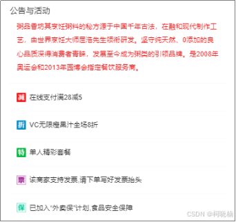
图15 商家活动公告内容
代码如下:
<template>
  <cube-scroll class="seller" :options="sellerScrollOptions">
    <div class="seller-content">
      <div class="overview">
        <h1 class="title">{{seller.name}}</h1>
        <div class="desc border-bottom-1px">
          <star :size="36" :score="seller.score"></star>
          <span class="text">({{seller.ratingCount}})</span>
          <span class="text">月售{{seller.sellCount}}单</span>
        </div>
        <ul class="remark">
          <li class="block">
            <h2>起送价</h2>
            <div class="content">
              <span class="stress">{{seller.minPrice}}</span>元
            </div>
          </li>
          <li class="block">
            <h2>商家配送</h2>
            <div class="content">
              <span class="stress">{{seller.deliveryPrice}}</span>元
            </div>
          </li>
          <li class="block">
            <h2>平均配送时间</h2>
            <div class="content">
              <span class="stress">{{seller.deliveryTime}}</span>分钟
            </div>
          </li>
        </ul>
        <div class="favorite" @click="toggleFavorite">
          <span class="icon-favorite" :class="{'active':favorite}"></span>
          <span class="text">{{favoriteText}}</span>
        </div>
      </div>
      <split></split>
      <div class="bulletin">
        <h1 class="title">公告与活动</h1>
        <div class="content-wrapper border-bottom-1px">
          <p class="content">{{seller.bulletin}}</p>
        </div>
        <ul v-if="seller.supports" class="supports">
          <li
            class="support-item border-bottom-1px"
            v-for="(item,index) in seller.supports"
            :key="index"
          >
            <support-ico :size=4 :type="seller.supports[index].type"></support-ico>
            <span class="text">{{seller.supports[index].description}}</span>
          </li>
        </ul>
      </div>
      <split></split>
      <div class="pics">
        <h1 class="title">商家实景</h1>
        <cube-scroll class="pic-wrapper" :options="picScrollOptions">
          <ul class="pic-list">
            <li class="pic-item"
                v-for="(pic,index) in seller.pics"
                :key="index"
            >
              <img :src="pic" width="120" height="90">
            </li>
          </ul>
        </cube-scroll>
      </div>
      <split></split>
      <div class="info">
        <h1 class="title border-bottom-1px">商家信息</h1>
        <ul>
          <li
            class="info-item border-bottom-1px"
            v-for="(info,index) in seller.infos"
            :key="index"
          >
            {{info}}
          </li>
        </ul>
      </div>
    </div>
  </cube-scroll>
</template>

<script>
  import { saveToLocal, loadFromLocal } from 'common/js/storage'
  import Star from 'components/star/star'
  import Split from 'components/split/split'
  import SupportIco from 'components/support-ico/support-ico'

  export default {
    props: {
      data: {
        type: Object,
        default() {
          return {}
        }
      }
    },
    data() {
      return {
        favorite: false,
        sellerScrollOptions: {
          directionLockThreshold: 0,
          click: false
        },
        picScrollOptions: {
          scrollX: true,
          stopPropagation: true,
          directionLockThreshold: 0
        }
      }
    },
    computed: {
      seller() {
        return this.data.seller || {}
      },
      favoriteText() {
        return this.favorite ? '已收藏' : '收藏'
      }
    },
    created() {
      this.favorite = loadFromLocal(this.seller.id, 'favorite', false)
    },
    methods: {
      toggleFavorite() {
        this.favorite = !this.favorite
        saveToLocal(this.seller.id, 'favorite', this.favorite)
      }
    },
    components: {
      SupportIco,
      Star,
      Split
    }
  }
</script>

<style lang="stylus" scoped>
  @import "~common/stylus/variable"
  @import "~common/stylus/mixin"

  .seller
    height: 100%
    text-align: left
    .overview
      position: relative
      padding: 18px
      .title
        margin-bottom: 8px
        line-height: 14px
        font-size: $fontsize-medium
        color: $color-dark-grey
      .desc
        display: flex
        align-items: center
        padding-bottom: 18px
        .star
          margin-right: 8px
        .text
          margin-right: 12px
          line-height: 18px
          font-size: $fontsize-small-s
          color: $color-grey
      .remark
        display: flex
        padding-top: 18px
        .block
          flex: 1
          text-align: center
          border-right: 1px solid $color-col-line
          &:last-child
            border: none
          h2
            margin-bottom: 4px
            line-height: 10px
            font-size: $fontsize-small-s
            color: $color-light-grey
          .content
            line-height: 24px
            font-size: $fontsize-small-s
            color: $color-dark-grey
            .stress
              font-size: $fontsize-large-xxx
      .favorite
        position: absolute
        width: 50px
        right: 11px
        top: 18px
        text-align: center
        .icon-favorite
          display: block
          margin-bottom: 4px
          line-height: 24px
          font-size: $fontsize-large-xxx
          color: $color-light-grey-s
          &.active
            color: $color-red
        .text
          line-height: 10px
          font-size: $fontsize-small-s
          color: $color-grey
    .bulletin
      padding: 18px 18px 0 18px
      white-space: normal
      .title
        margin-bottom: 8px
        line-height: 14px
        color: $color-dark-grey
        font-size: $fontsize-medium
      .content-wrapper
        padding: 0 12px 16px 12px
        .content
          line-height: 24px
          font-size: $fontsize-small
          color: $color-red
      .supports
        .support-item
          display: flex
          align-items: center
          padding: 16px 12px
          &:last-child
            border-none()
        .support-ico
          margin-right: 6px
        .text
          line-height: 16px
          font-size: $fontsize-small
          color: $color-dark-grey
    .pics
      padding: 18px
      .title
        margin-bottom: 12px
        line-height: 14px
        color: $color-dark-grey
        font-size: $fontsize-medium
      .pic-wrapper
        display: flex
        align-items: center
        .pic-list
          .pic-item
            display: inline-block
            margin-right: 6px
            width: 120px
            height: 90px
            &:last-child
              margin: 0
    .info
      padding: 18px 18px 0 18px
      color: $color-dark-grey
      .title
        padding-bottom: 12px
        line-height: 14px
        font-size: $fontsize-medium
      .info-item
        padding: 16px 12px
        line-height: 16px
        font-size: $fontsize-small
        &:last-child
          border-none()
</style>
项目源码下载:
https://download.csdn.net/download/p445098355/89570496
原文地址:https://blog.csdn.net/p445098355/article/details/140640834
免责声明:本站文章内容转载自网络资源,如本站内容侵犯了原著者的合法权益,可联系本站删除。更多内容请关注自学内容网(zxcms.com)!